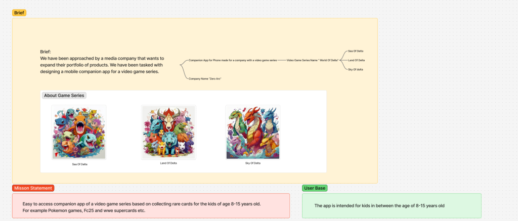
To begin with my companion app I read the brief given by the company as the company name was not mentioned I named “Zero Arc” just as a random name and as for the game series I named it “World Of Delta”.
Objective of the companion app was to make an easy accessible companion app for kids of the age 8-15 years old.
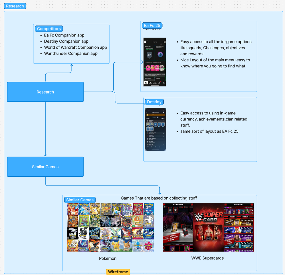
Further I started researching on the existing companion app like EA Fc 2025, Destiny and others to get to know what other companion app looks like and integrate the wireframe of the app. Since I had some idea about the companion apps as I my self have used some of them for my personal uses like EA fc25, I started designing the initial wire frame of the companion app and how it should look like. But, before that i need to do some research on some of the similar games that going to be my competitors. So, I searched bunch of games with the similar stuff like games based on collecting rare stuff (cards, Pokémon , metals). One of the great example were Pokémon an you start a journey to capture new and rare Pokémon.
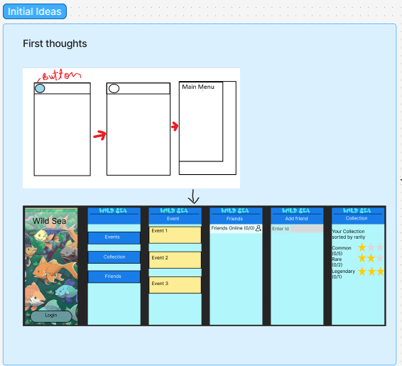
So, initially I wanted to have a drop down menu instead of the in beaded menu at the bottom as i felt that is way cooler but it became more complicated down the line and also in the practical use of companion app you want it to simple for your user to access the companion app that’s why i decided to go with the bottom menu.
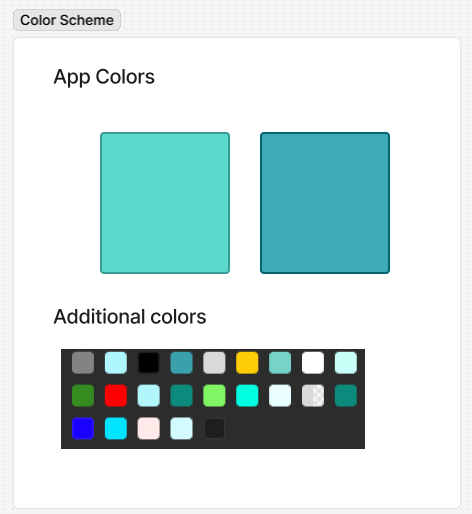
For the colour scheme I went with this colour as kids normally like bright colour and find them attractive but if you put really bright colours like red, navy blue it kind of hurt the eyes not just from prospective of eyes Doctor but also from a gamer prospective. Teal is personally my favourite colour that was the another reason for going with this colour. In contrast I choose a dark teal for gain some focus like for menu as I feel our eyes feel comfortable looking at dark colour.
https://www.figma.com/board/BgnUI1Y46ULEYw87H2xLU9/Companion-app?node-id=0-1&t=KJ9Rg4prlOxSVduk-1